Below is our final product, I don't want to ruin the story at all so please just enjoy our film:
Saturday, 7 January 2012
Evaluation Activity 4 - How did you use media technologies in the construction and research, timing and evaluation stages?
Im sure my entire group will agree with me when I say I love to capture every moment. Whenever I see Jack asking Anthony to repeat something so he can get it from another shot I always feel the need to record the example of teamwork that occurs within our group and show it off to the rest. The only way I am able to do this is by using all the technology that I have. Although I understand the importance of written work and essays I can imagine an essay on our last shot holds the same calibre of a video letting the viewer step into our world and witnessing the moment for themselves. Everything I use is high definition and only the best quality.
I thought for my evaluation it would make more sense to use my HD camera to present an in-depth video description of every single form of new media technology I have used to update the blog. as well as maintain communication with other members of my group. Another aspect that should be taken into account is that we are the first ever group to do this. The amount of effort that went into just making sure we skype each other every day to share ideas was outstanding and it all contributed to created both a film and a blog of high standards. Please enjoy the Video below:
I thought for my evaluation it would make more sense to use my HD camera to present an in-depth video description of every single form of new media technology I have used to update the blog. as well as maintain communication with other members of my group. Another aspect that should be taken into account is that we are the first ever group to do this. The amount of effort that went into just making sure we skype each other every day to share ideas was outstanding and it all contributed to created both a film and a blog of high standards. Please enjoy the Video below:


Evaluation Activity 3 - What have you learned from your activity feedback? Part 1
After finishing the editing of our film we decided to ask some friends and family if they would watch our film and then fill out a questionaire. I personally wasn't happy with our previous questionnaire (shown in a post below) that we did earlier as the questions felt a bit out of place and rushed. I quickly decided to make another questionnaire with more suitable questions. The results from the questionnaire were very important for us as it would greatly help us with knowing what we could improve on and what people liked.
The questions we asked were:
1. What is your Gender?
2. How old are you?
3. Was the storyline confusing to you?
4. Did our film compare well with professionally made shorts?
5. Did our film influence you to watch other shorts?
6. Would you recommend "Limbo" to others.
We decided to ask these questions because we only wanted to ask questions we deemed very important. We were extremely happy with the results we got and felt the questionnaire was a success. In Part 2 of this Evaluation you can see the results.

Evaluation Activity 2 - How effective is the combination of your main product and ancillary tasks?


Why is our magazine important?
Our Film has so much emotion crammed into it is absolutely spectacular but of course the film itself does not represent our entire project. We have all worked extremely hard on our ancillary tasks. The ancillary tasks consist of a poster and magazine article that we have produced.
The Magazine article consists of several points that both promote our film and excite the audience> it is important that we have a good magazine article to go with our final film because it is hard for us to sell our story without giving away the ending. A magazine review offers feedback from a third party that will excite and reassure the reader that Limbo is in fact much worth seeing.
As you can see Ant has made the article look like any other big time movie review. Key points that make the magazine look professional are pointed out by the arrows.
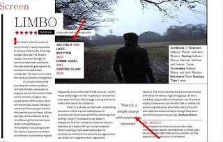

The higher up arrow points out the brief information box, if you open up any legitimate film magazine you will see they all do this. The second arrow pointing to a quote made bigger is also a key fundamental of a film review. It draws in the reader and convinces them that it is worth the read.
Why did we think a magazine article would be so important?
The combination of our film and a magazine article with a superb poster allows us to have the best impact on a a possible audience. The whole theme of limbo is that the audience has an experience from the first time they hear about the film to the riveting moment they whiteness the shocking twist ending. To take away the magazine article and poster from our film would be robbing it of its greatness and what it deserves. All aspects of the ancillary task make up the final project.
Evaluation Activity 1 - In what ways does your media product use, develop or challenge forms and conventions of real media products?


As a group we were extremely unsure of what we would finally call our film. I dove into some research of my own to figure out what type of title would fit in with our chosen genre of horror. Within my results I found out that typically a film contains a one word title supported with the word "the" to put greater influence on this, examples would be "The Ring" or even "The Exorcist". The use of "the" simply adds a bigger input signifying its important's and the fact that the controlling idea relates to this word or in some cases even is the word. Now, taking this into account the group and I know the controlling idea of the film is limbo, but were unsure if we wanted to settle with a one word title, we felt it could perhaps give off a boring feel to the title, which automatically can cause the audience to dislike the film. However, after much deliberation we felt "Limbo" was the perfect title, it simply explains the film to ensure no confusion is created for the audience at the films twist. This alongside the fact that the word gives off an ominus feel, which is somewhat haunting, linking it directly to our chosen genre and somewhat causing the genre to develop following typical codes and conventions.

2. Setting/Location
In terms of our overall setting and location we felt it would be extremely effective to only use one location. This decision has been one of the toughest, due to the fact that we felt it may prove to be rather boring. However, through our research into short films like Doodle Bug, we noticed that the entire film takes place in one dark and dingy room, and yet the short still had an amazing effect in making itself the short film we were most influenced by when creating Limbo. Upon location hunting, the entire group agreed that a wood would work perfectly for the film. Upon the location hunting itself, Jack and I took time out to visit the location to check it was exactly what we wanted. The large eerie looking trees drowning out the sunlight gave the dark feel, and instantly we were influenced by some shots within our surroundings. We were nervous at the fact that the entire film would take place in the wood and wanted to ensure that the film didn't become too boring and was always fresh, so we decided to exit the wood and stumbled across a large field. Perfect for extreme long shots and flowing perfectly from the wood we knew this was the perfect location. The initial idea to use a wood was drawn from the horror movie Signs, where Mel Gibson's character explores the crop field in search of something strange. This scene is one of my favourites in the film and I felt it most effective with the scares, the tension builds throughout the entire walking process until he sees the actual scare. This is something we wanted to incorporate into Limbo, but with our own twist making it something of our own.

3. Costumes and Props
The choice of costumes didn't come too easy. We had the controlling idea of Limbo but were unsure how to portray the character. Initially we wanted him to perhaps seem as though he fits into the lower class and comes across as a person with a very low income, so we felt perhaps clothing that has been ripped apart, giving that worn out feel, suggesting that the character in a way has had enough and in a way has given up. However, after much deliberation we felt it important to make the main protagonist appear as a regular, everyday man who the audience can relate to. The leather jacket in many ways we feel shows off an adventurous side to the character whilst the scarf with the skinny white strips indicate that this place he is in is cold and bleak setting. Also, a prime example of the props we used are all through the character of the drug dealer, we used extreme close ups on the props to spark the flashbacks and example would be the cigarette, seeing it immediately sparks a memory for the protagonist as the flashback reveals the hooded mysterious man smoking.

4. Camera work and Editing
We were delighted with the shots within our film. We ensured that we filmed more than we needed, so that every shot in a sequence was in some way different, making the sequence interesting. Also, the decision to film more than we need was to simply ensure that the best possible angle is used for each shot, so during the editing process we were able pick and choose what we liked best, making the film the best we could make it. This year Jack and I took the editing to a whole new level, we wanted to try many techniques that were out of the ordinary to make our film unique, and also in a way foreshadow the events in the conclusion. For example, fades were used as I was walking through the wood to create a somewhat ghostly feel to certain shots. Also, something that hasn't been done before was cloning, Jack understood that if i were to sit one side of the screen, and walk over to the opposite side of the screen, he would be able to cut the clip in half and crop the two together, to create the illusion that I am looking at myself. This shot went down well within audience feedback and we feel it is something that makes our ending that little bit more brutal.

The title of our film was something that came last, we had our controlling idea, filmed and edited but we were unsure of what to call it. After much deliberation we settled on Limbo, as the entire concept of the film was about a man stuck in Limbo. Now with the title finally chosen, Jack and I began the process of deciding the font, we settle don the font showed in the image, we felt it was extremely simple and in a way reminded us of one of our influences credits, "Inception" where the word appears in all capitals in a white font placed on a black back ground, giving off the powerful effect of the film within the title. The group also drew influence with "Inception" in the position that the credits will appear, we settled on playing them after the film itself (including the title) this in turn helps to keep the ending in some ways a secret for the audience, for if the title was to appear at the beginning of the film, the audience would automatically know he is in Limbo, which could perhaps ruin the startling conclusion.

The film immediately begins with a serious of rapid editing on the protagonist as he awakens in a strange wood. The camera shows close ups on the protagonists face as he begins to look confused and is constantly frowning, almost as if he reconsigned the place he is in. When an extreme long shot is used to show himself isolated in the wood he begins to walk around until he finally proceeds to walk past the camera. Through the editing process we were able to make the protagonist fade into his own steps, giving off a somewhat ghostly feel to the shot. Just the opening 30 seconds above subtly tell the audience the story of our film, the fact that this place is his last memory, and that he is in fact a ghost within limbo, reminiscing and recognising his surroundings.

Our chosen genre for our A2 film is a horror. The horror genre is something we are all familiar with as a group and with further research we were able to recognise what the typical codes and conventions of the genre is. Taking them into account, we wanted to make an initial impression within the first few seconds of our film, so the audience knows for certain that the film is a horror. The way in which we did this was to instantly in a way startle the audience, we do this during the wake up scene, where the close up on the protagonists face shows him asleep and in some way peaceful, when suddenly the camera switches so it's directly in front of him as he suddenly comes forth with a rapid pace. We were able to edit the sound so the volume was loud diegetically, this adds to the audiences reaction as we hope to perhaps make them react as we catch them off guard. Also, the constant use of the low key lighting is something we were keen to use, as it is often used in the majority of horror movies, and in a way is signature to the genre. An example of this used within a film could perhaps be "The Exorcist" when the vicar exits the taxi and stands looking at the home, the extremely low key lighting in a way is broken up but the vicars breath, the breath is something we were extremely pleased to see come out nicely within our film on the camera within the editing process.

8. How characters are introduced
As discussed previously the main protagonist is introduced with an extreme close up, as the editing rapidly shows him getting up, he's portrayed as something our audience can relate to, giving it in some ways a fearful edge making the audience feel as though this place is real and could even happen to them. Essentially, the two other characters are introduced through flashbacks from the protagonists past. The first shows a hooded man who appears to have a dominant size advantage over the protagonist as he tells him where to go, this in some ways gives a peer-pressure feel to the sequence, something that perhaps challenges the genre of horror, as he is influenced by others rather than himself. The second shows the protagonist approaching a hooded man smoking a cigarette, as the two characters meet the character in the hood instantly appears to be completely different to the protagonist, seeming un-welcoming, it would also be tough for the audience to relate to him, as he comes across as dangerous. The differences of the two characters shown in a two shot we feel is a great way to introduce the character, as it makes it seem as though the protagonist doesn't usually purchase drugs, and that this may be his first time. Once more challenging the genre and relating back to the peer pressure point made previously.
Friday, 6 January 2012

Ancilliary Task: Poster - Final Draft

Above is the poster I designed for our short film Limbo. I wanted to make it as simple as possible without it being boring and bland. I decided to put a syringe at the top because at first glance it is extremely mysterious but doesn't give away to much of the plot. I also loved the simplicity of the font as it is extremely eye-catching and mysterious. I am also extremely happy with the fade from white to black which almost signifies the journey into Limbo itself.
Subscribe to:
Posts (Atom)